
Useful tips and tricks on what to do and what NOT to do when creating a new logo for your business
I often get asked for help and advice from clients wanting to redesign their logo or when creating new logos, so I decided to put together a quick and straight-to-point list of Do’s and Don’ts of Logo Design.
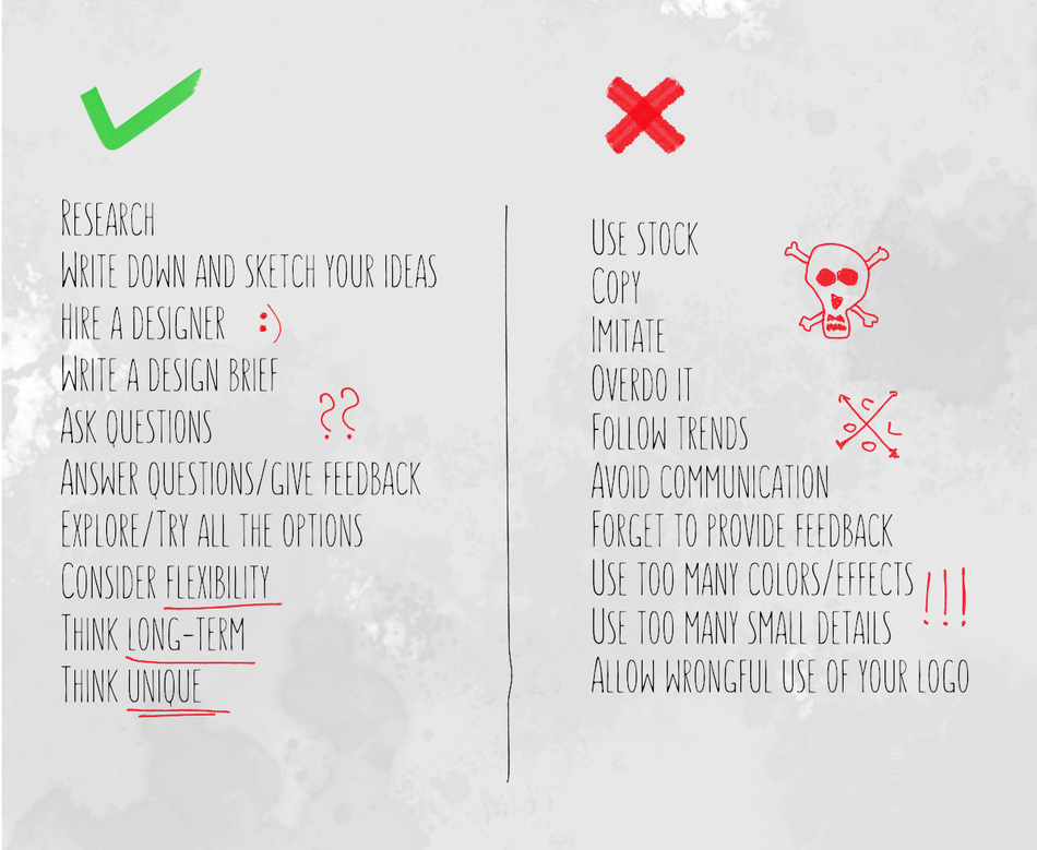
PLEASE DO
Research
Write down and sketch your ideas
Hire a designer
Write a design brief
Ask questions
Answer questions/give feedback
Explore/Try all the options
Consider flexibility
Think long-term
Think unique
PLEASE DON’T
Use stock
Copy
Imitate
Overdo it
Follow trends
Avoid communication
Forget to provide feedback
Use too many colors/effects
Use too many small details
Allow wrongful use of your logo
PLEASE DO
RESEARCH
Before starting the creative process do some research. Find out who your audience is, and which brands are your competition. Research the market, opportunities, existing brands in the market, and find an area where you can expand and innovate. This will help you define the core values of your brand which will be built into your logo and brand guidelines.
WRITE DOWN AND SKETCH YOUR IDEAS
It’s always good to have a starting point. Make a list, write down your ideas and explain your visions. You don’t have to be an artist to sketch a simple idea. No matter how trivial or poorly sketched your idea is, it’s a starting point and every professional designer should be able to take it from here.
HIRE A DESIGNER
There are plenty of tools out there to help you create a logo all by yourself or even crowdsource the logo design, but hiring a professional designer offers a lot of other advantages that will help you build a serious and professional brand. When you hire a designer you also get professional insight, advice, suggestions, development, technical help.
WRITE A DESIGN BRIEF
When you hire a designer they will most likely ask you to fill a design brief, a questionnaire about your business ideas, audience, competition, color preferences etc. You can use your research notes and expand into the brief, and remember - the more info you fill in, the better understanding designers get of your business and ideas.
ASK QUESTIONS
If you hired a designer don’t hesitate to ask questions about the concepts and drafts they sent you. Ask for explanations and clarifications on designs.
ANSWER QUESTIONS
Designer’s worst nightmare isn’t bad feedback. It’s LACK of feedback that’s truly frustrating. So feel free to comment, answer questions, share your thoughts and further ideas, ask for changes, try different options, but make sure you do provide timely and constructive feedback.
EXPLORE
Sometimes, when you’re not certain the design process is going the right way, it’s good to experiment and explore different approaches to create something unique and innovative. Don’t hesitate to ask for additional revisions (given that you are ready to pay for them!).
CONSIDER FLEXIBILITY
In the multi-channel marketing world of today it’s important to have your logo created in such a way that it’s flexible enough to be clearly visible on all screens and all print sizes. It should look great in black and white and with shading. It should work well with and without text and/or tagline. This is where having a professional designer close at hand is an excellent idea because they can quickly adjust your logo for different purposes and make sub-versions or quick fine-tunings.
THINK LONG-TERM
Maybe the hardest part when creating a logo for your business the very first time is to create something that you’ll stick with for the next 3-5 years, at least. So when you’re putting together your ideas and concepts, always have in mind the long-term aspect. Your logo is something that will be representing your brand and changing it very often will decrease its recognizability and cost you customers in the long run.
THINK UNIQUE
Everybody can whip up something in 5 minutes and call it a logo, but if you read through the previous nine points, you’ll quickly come to understand how important it is to have a unique representation of your brand and how many factors a successful logo/brand design requires. I often get asked to create a typographical logo that includes both a symbol and a letter, and logos like that always become something not only of market but also a personal value, something clients connect to and make it their own.
With that said, you certainly don’t want to do the first point under Don’ts. So,
PLEASE DON’T
USE STOCK
Do you want to use something that everyone else is using? Do you want your logo to look just the same as that other guys logo? Or more importantly, do you want your customers to notice that?!
COPY
No seriously, just don’t.
IMITATE
Not the same as copy, but potentially even worse. Your brand will not only come off as dull, idealess, fake, cheap, but…. Do I even need to continue?
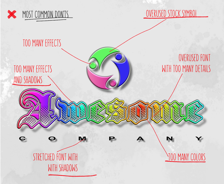
OVERDO IT
For the millionth time, LESS IS MORE! Too many details can ruin the visibility in small print and smaller screens. Clashing colors will make it hard to read. Add too many shadows and accents and your logo will be too complicated to reproduce in print. If you can’t recognize a brand in just a few seconds you will not remember it.
FOLLOW TRENDS
Remember the “bevel/3d-everything” era? Those companies all had to redesign their logos once that madness was over. Why? They looked outdated. The same will happen with all the hipster arrows-X-logos-and-thin-fonts so popular today. A timeless design is simple, clever, a unique shape, looks good in black & white, and is flexible enough to use with shading and gradient.
AVOID COMMUNICATION
If you hired a designer they are probably asking your a thousand questions. (If they’re not, you might have hired the wrong designer!) They’re not being curious, they’re trying to get to know you and gather as much info as possible. When creating a custom and unique logo, designers want to make sure they’ll hit the spot with the concepts. Sometimes just a simple chat is enough to help spark the creative process.
FORGET TO PROVIDE FEEDBACK
When you receive drafts from your design team, make sure to provide timely and constructive feedback and answer all the questions. Also, feel free to ask questions. Good two-way communication is crucial to creating a successful design project.
USE TOO MANY COLORS/EFFECTS
Take some time to research color theory or ask your designer to help you with picking a palette for your brand. 2-3 colors is max because you’ll want to make sure your logo looks good in one color as well as black & white.
USE TOO MANY SMALL DETAILS
Using too many small details will decrease recognizability of your logo. A detailed floral or line-pattern will not leave a visual impact on customers as will a simple, strong shape, preferably with a meaning/message.
ALLOW WRONGFUL USE OF YOUR LOGO
Not necessarily a part of a creative process, but nevertheless a key point in your brand presentation - do not let agencies or individuals use your logo in any way other than intended - no stretching, recoloring, rotating, or other deviations other than provided in the brand guidelines.

Darko Kriznik is a graphic designer with 15 years of experience in graphic design and a strong background in the printing industry, specialized in logo design and branding.
Write a comment